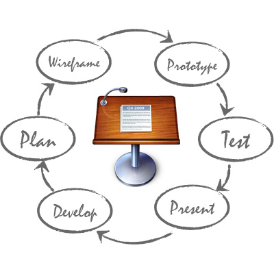
Prototyping is a critical developing phase. During prototyping you may find design problems on your app that, if not detected early, would probably make you and your team waste an important amount of time.
There are a lot of techniques and tools to create prototypes. You can prototype on paper while brainstorming and use sophisticated tools later to create visually appealing prototypes.
However, I decided to use Keynote for prototyping my last client app Aduho Mirror. In today’s post I would like to share my reasons and experience.
You can download the mockup in Keynote or PDF format to compare it to the final published app.
Why Keynote?
As you can see, Aduho Mirror is a very simple app. However, I needed a way to work on an original app design and to communicate it to the other members of the team, specially to artists. So, I chose Keynote to prototype this app for the following reasons:
- Keynote is very easy to use
- Everybody knows it and knows how it works. Nobody is afraid of Keynote 😉
- It allows me to prototype with very simplistic wireframe shapes
- It allows for side notes and examples to clarify some issues about the app screens
- Its very easy to share with non-technical people
- You can visualize the same mockup on the Mac and on the iPad in Keynote format
- You can export it as PDF and visualize it universally
So, as you can see, there are a number of very interesting reasons to use Keynote as a prototyping tool. Moreover, Keynote includes powerful drawing tools, smart guides, styles, locking, and grouping. Master slides make it possible to reuse interface components across multiple screens, hyperlinks add “clickability” to the prototype, and slide transitions create cool interface animations with a single click.
In the following images you can see how my prototype looks like.
I could have used some of the (amazing) Keynote templates for app prototyping available out there. However, Aduho Mirror is not exactly a standard app. So, using standard iPhone controls could narrow the artist’s scope. I didn’t want to influence the artist creation process at all.
That’s why I finally decided to use the native Keynote tools to create simple shapes that act as iPhone UI controls. Another advantage of using basic shapes is that you keep things abstract so people is forced to focus on design issues. No technical or artistic issues are involved at the prototyping phase.
The drawback is that it is difficult for some people to visualize the app watching at this so simple mockup. They only see lines and shapes at the beginning. But with a little training everything works just fine.
Keynote Hyperlinks
There is only one technical thing to take into account to create an app prototype with Keynote: Hyperlinks.
Every shape or object in Keynote can be enabled as hyperlink:
This way you can hyperlink all the “touchable” items in your mockup and allow the user to navigate through the prototype. This will work both on Keynote and PDF formats.
You can even do one more thing to improve the experience. Go to the Document pane of the inspector and chose “Hyperlinks only” for the “Presentation” field. This will prevent the user to browse the presentation with mouse clicks, buttons or gestures. This feature will not work on PDF format.
Conclusion
In my previous apps, I noticed that communicating the app concept and design was an issue. A lot of time was wasted with non-productive conversations that repeated during the first stages of development. Sometimes I feel like being trapped in an infinite loop…
It take me about 2 hours to come up with the protype I shared in this post, starting from a blank page and no previous ideas. An it saved me and my team a lot of time. The time necessary to communicate the concept was drastically reduced and the artist had a solid “document” to work on and use as reference. It improved communication and reduced the number of iterations both on interface design and graphical design.
The final app is not exactly as the prototype describes, but this is the usual process. The prototype is only intended to detect design issues on early stages of development and unify the mental views that every team member has about the future app.
So, in general, I’m happy of the resulting experience. I will keep using this technique for app prototyping 🙂
This post is part of iDevBlogADay, a group of indie iOS development blogs. You can keep up with iDevBlogADay through the web site, RSS feed, or Twitter.


Pingback: week3: iteration. iteration. iteration | Spring 2014 Thesis 2
Pingback: week4: Individuals | Spring 2014 Thesis 2